Fossil-fuel-backed group’s proposal would bar consumers, communities and states from holding oil companies accountable for climate deception Washington, D.C. — The fossil-fuel-linked American Legislative…
Medical Board of California Responds to the Public’s Request for Maternal Mortality Project Announcing Plan for Maternal Mortality Task Force Los Angeles,…
Beware. The predictive algorithmic modeling that home insurance companies deploy regarding wildfires is poised to come for California car insurance premiums. And…
Final order locks in reduced rate increases, refunds with 10% interest, and additional consumer protections LOS ANGELES, CA — California Insurance Commissioner Ricardo…
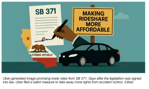
Sacramento, CA — Compromise legislation designed to avert a California ballot initiative showdown with Uber strikes a reasonable balance based on a review of…